An in-depth brand study of a café that encourages its audience to embrace their personality
Brimstone Brewery was named after the 'Brimstone' butterfly. The butterfly is known to have the longest lifespan. The life cycle of a butterfly caught my interest, and I wanted to include it in this study in some sort of way.
On this project, I collaborated with several artists. Each of them had different ideas, and there was no clear direction, but as we shared our vision for the brand, we found ways to implement our ideas, resulting in Brimstone's deep meaning.
I asked a few artists how a café can stand out, and they suggested that it be divided into two sections. A “playful” and “work” environment.
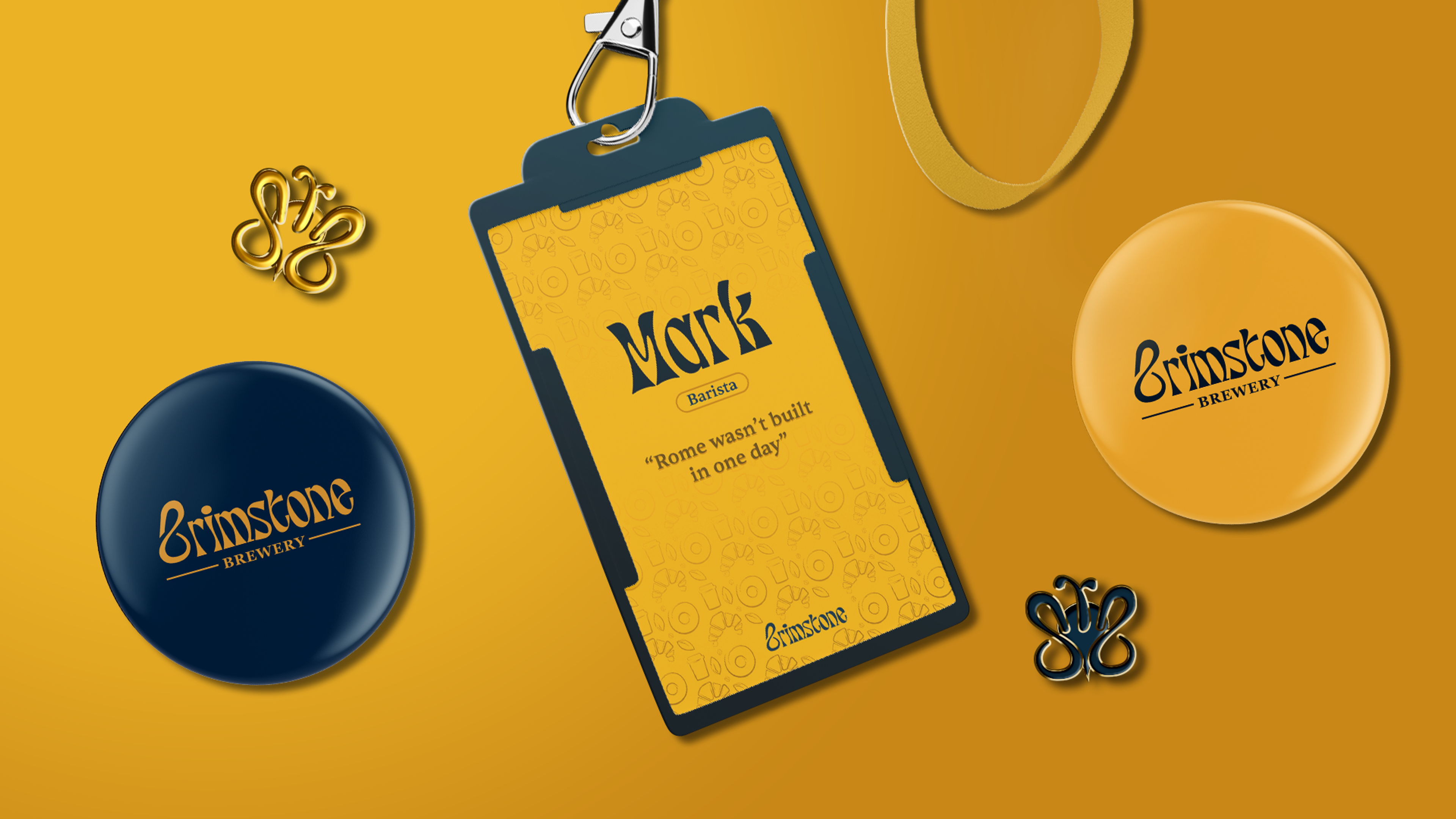
With that said, I wanted to experiment with colour in an interesting way, and I wanted to do so by simply changing the palette to affect the mood of a design. That's why I chose yellow and blue.
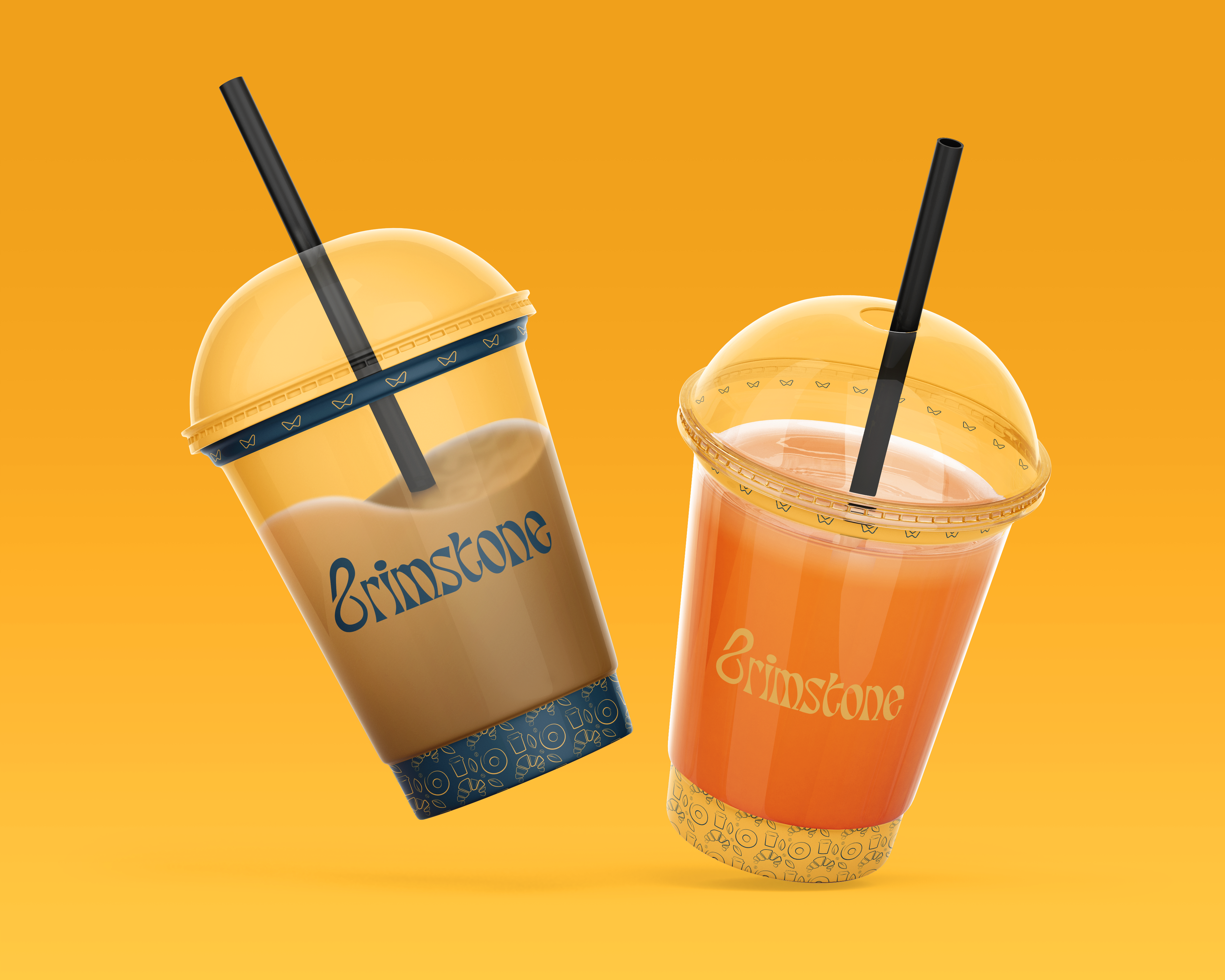
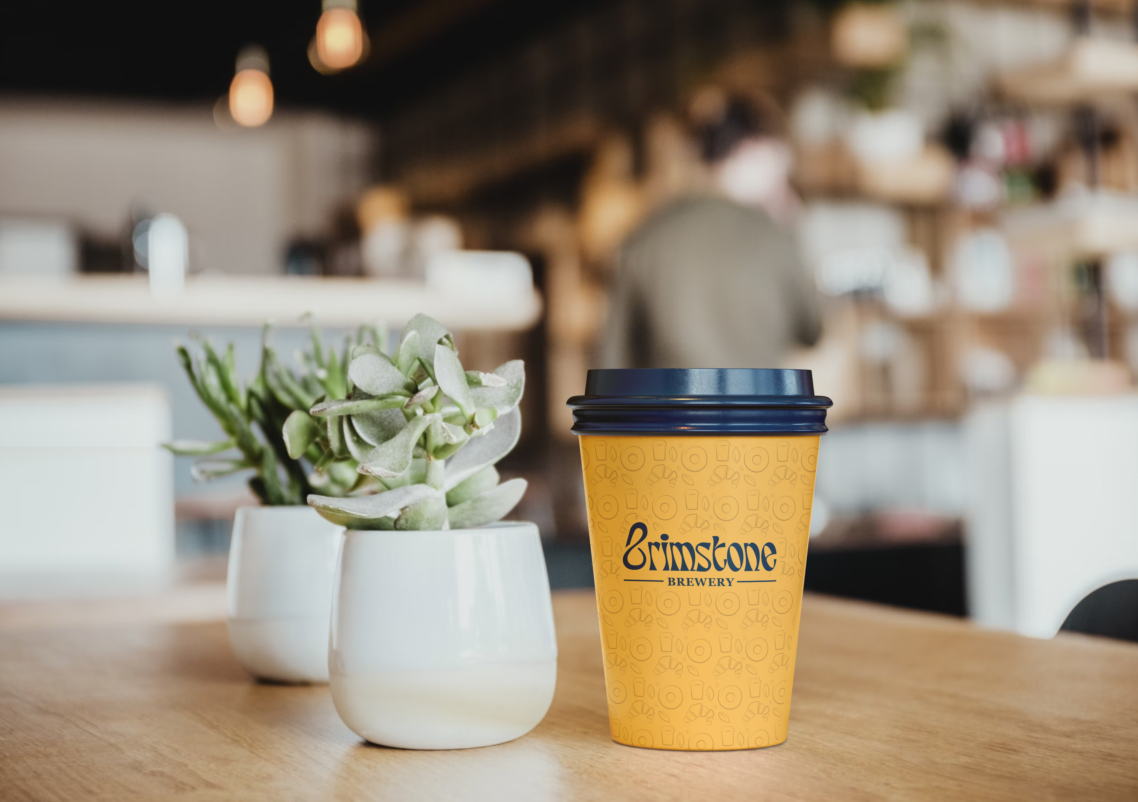
Yellow on blue is intended for a professional setting, whereas blue on yellow appears playful.


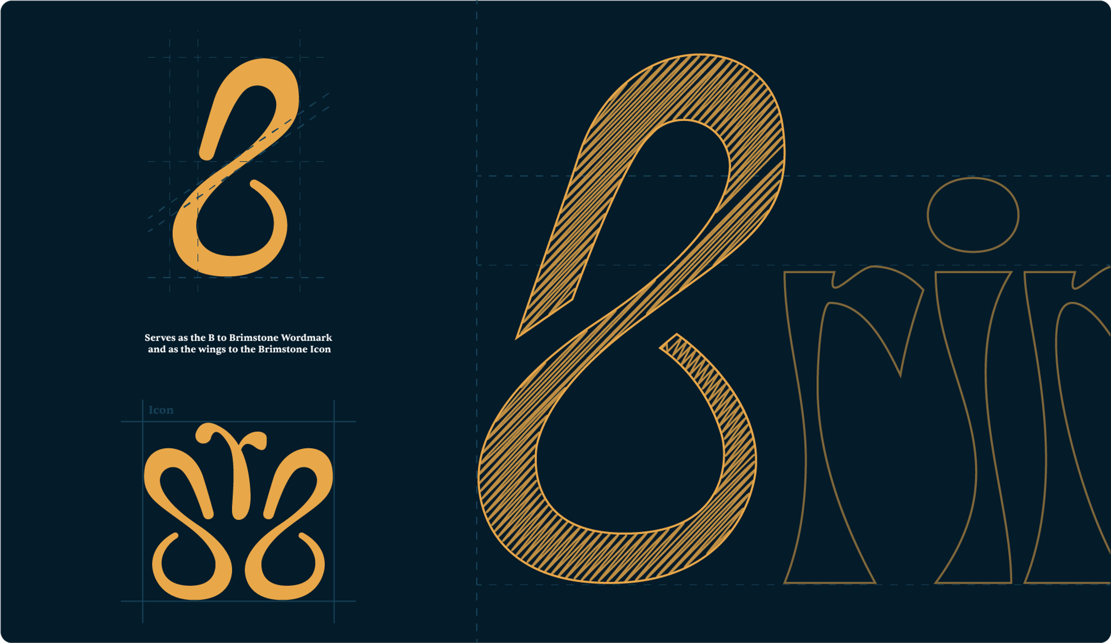
 Banner and I had different ideas about how to approach this identity, but we came to a beautiful conclusion when our concepts led us to create an icon and wordmark with a hidden meaning.
The “B” served as not only a letter but also as the wings to a butterfly.
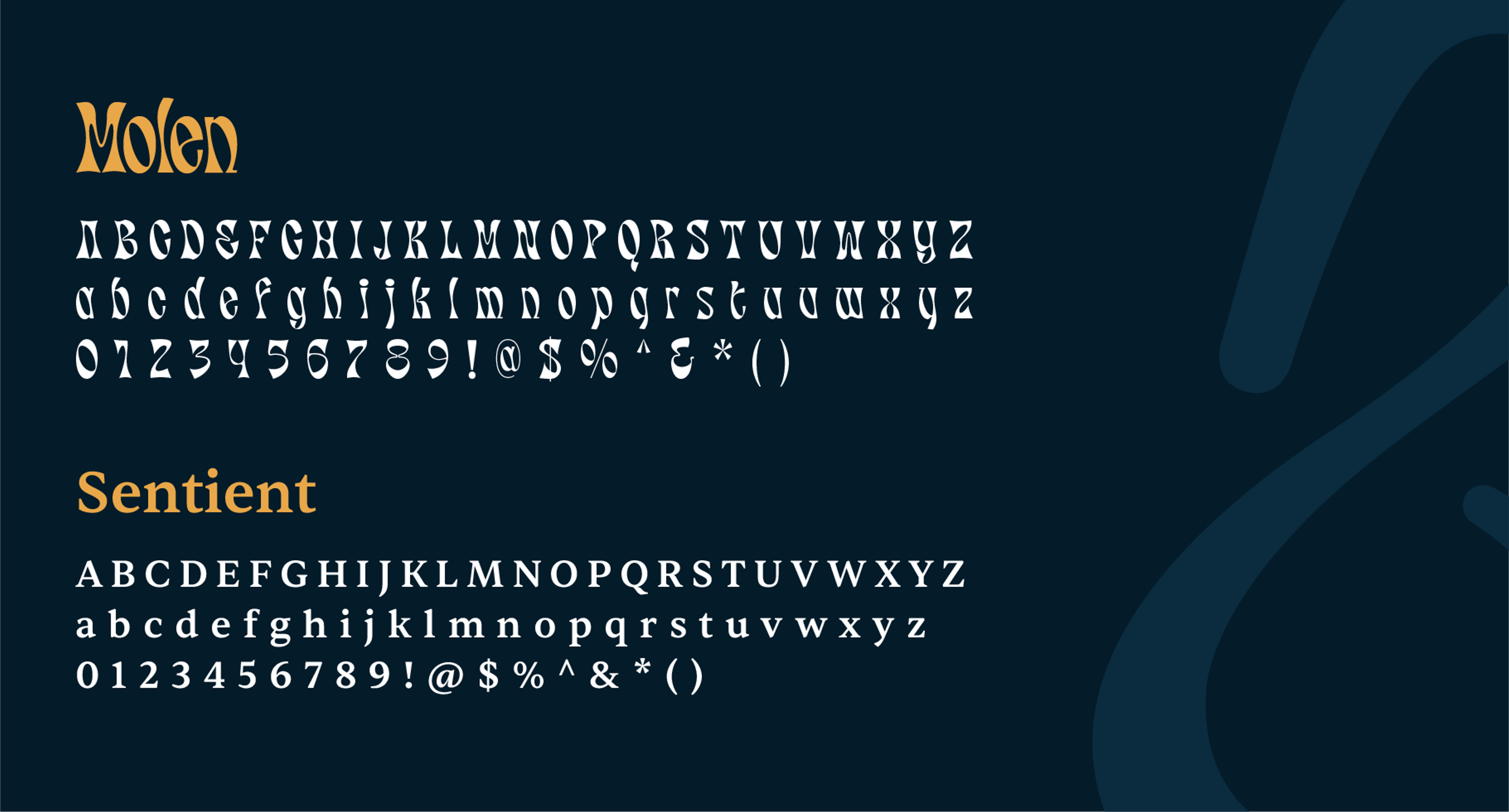
We had found a typeface that worked well with the 'B' at this point, but I felt we needed to tone down the energy. This led us to discover a sophisticated serif font that complemented our wordmark.
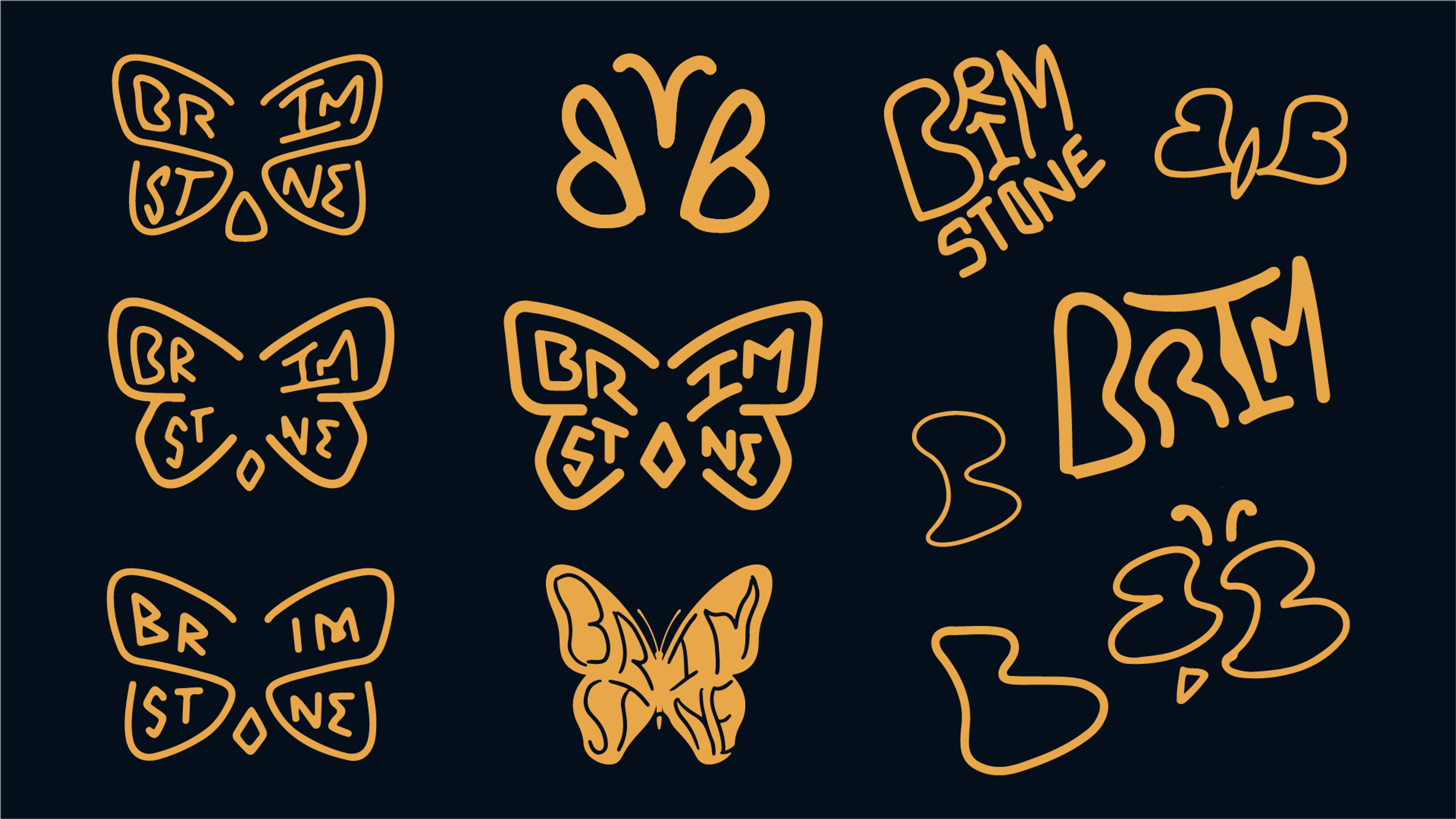
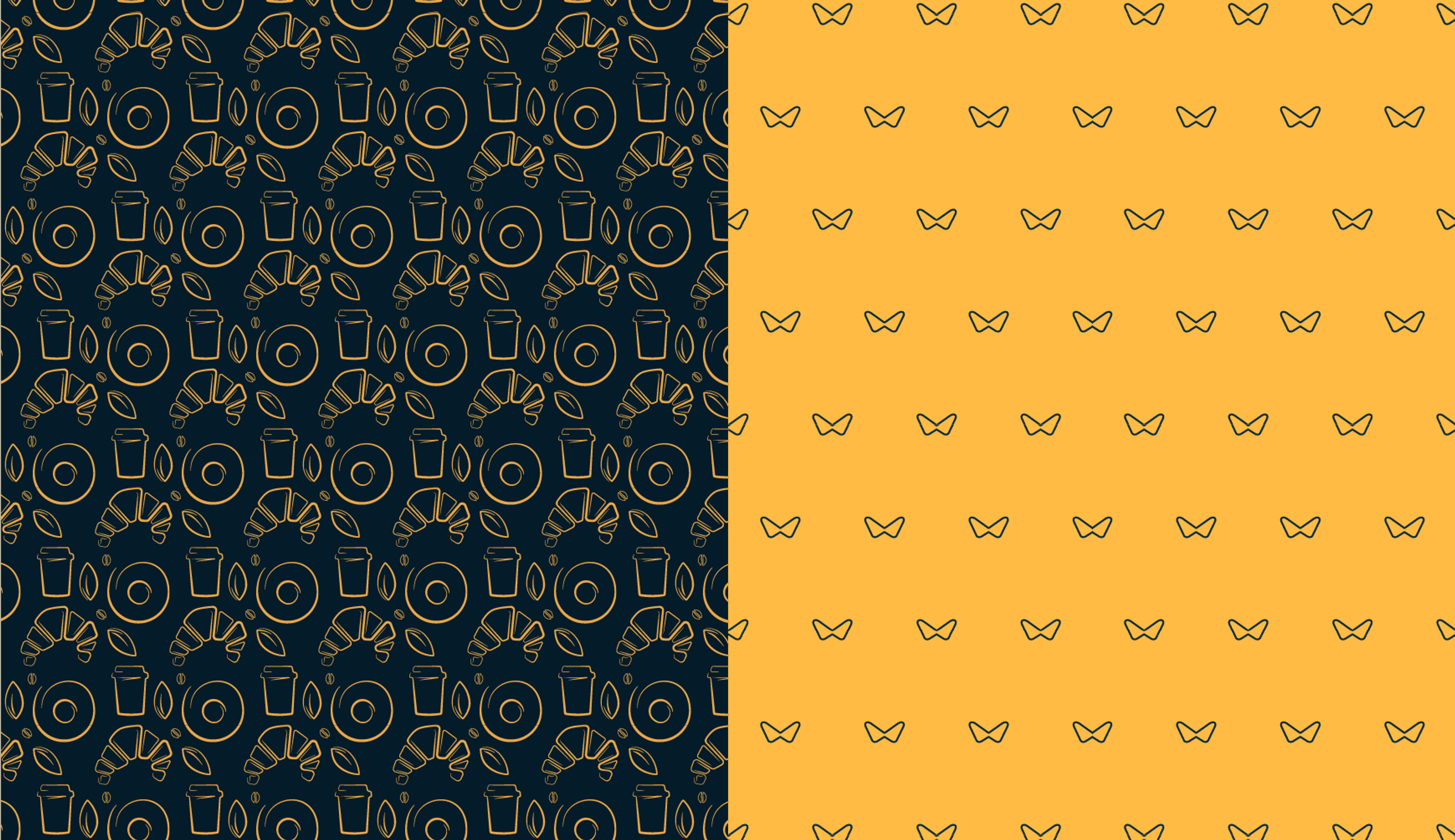

A small but crucial detail, the custom iconography purposefully has an inconsistent style, giving it a hand-drawn appearance. The reasoning behind this was that every detail matters, even if it appears insignificant.
This helped me create a consistent and unified design language for the icons throughout the brand.
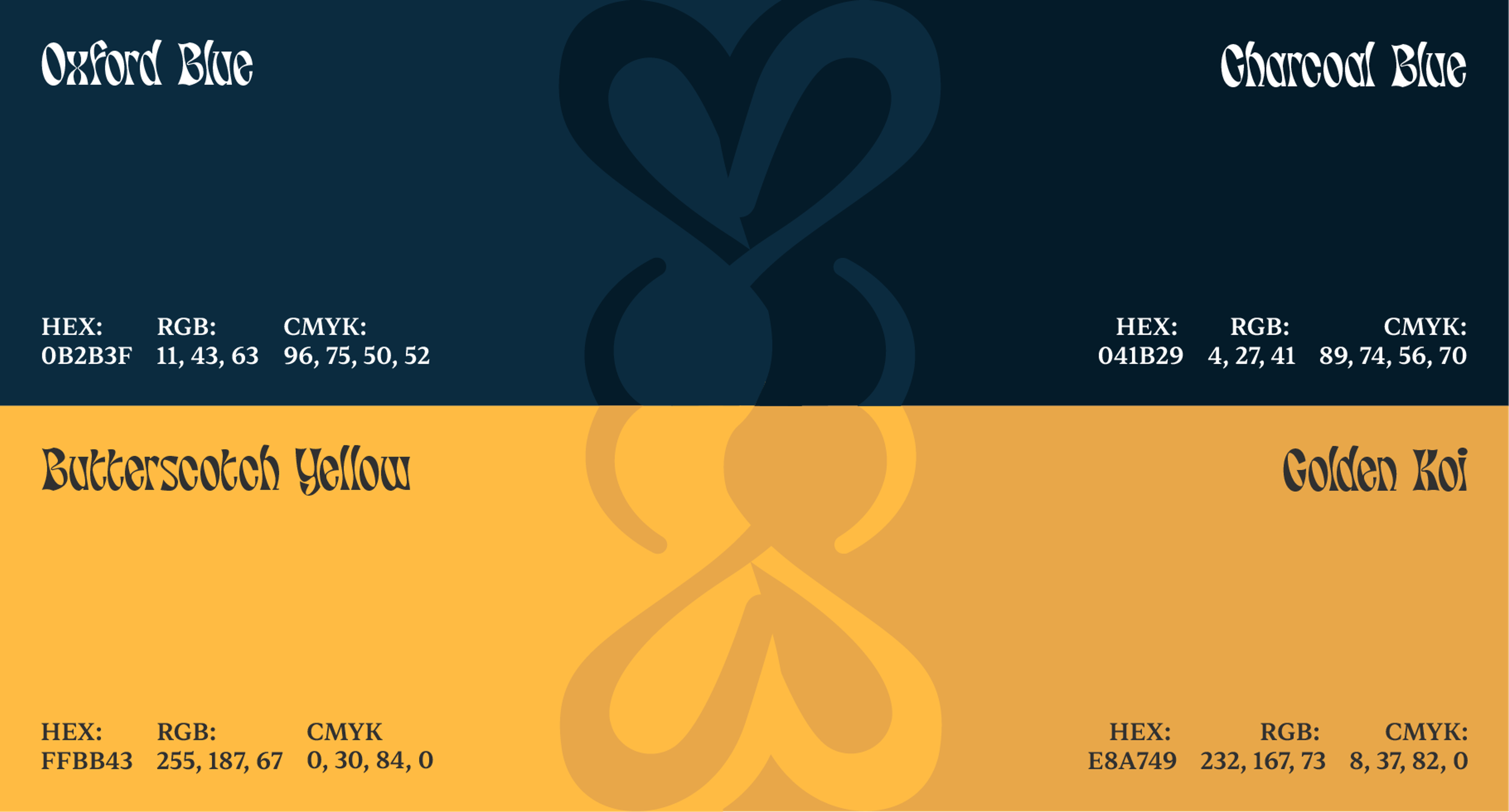
A butterfly's life cycle, as you may know, has several stages. In some ways, I wanted the café to reflect that. You may visit to focus on work or to relax and enjoy a cup of coffee.
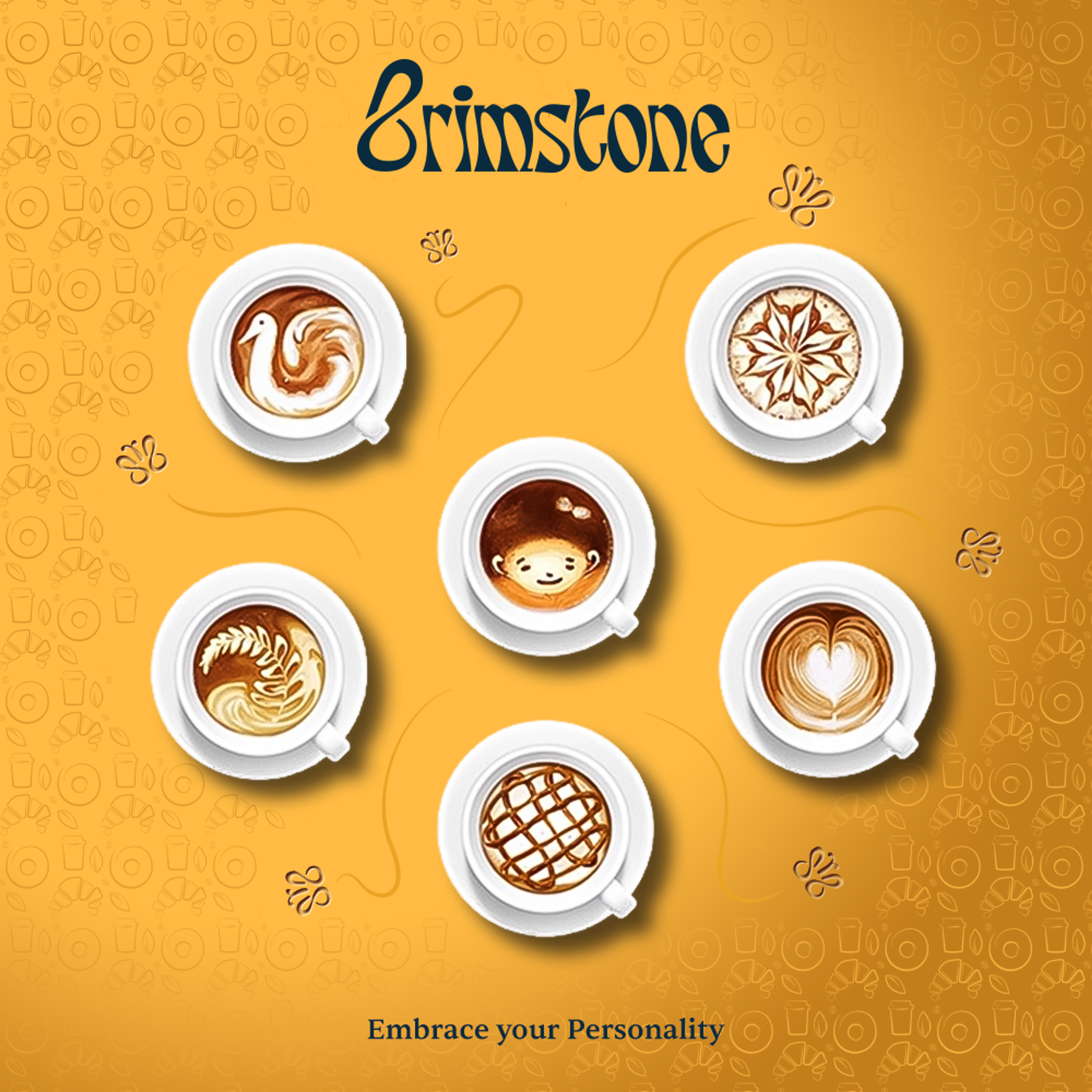
We encourage people to embrace their personality, and we want people to have a memorable experience at Brimstone. Using our clever palette, we want to draw attention but also need to know when to tone it down.
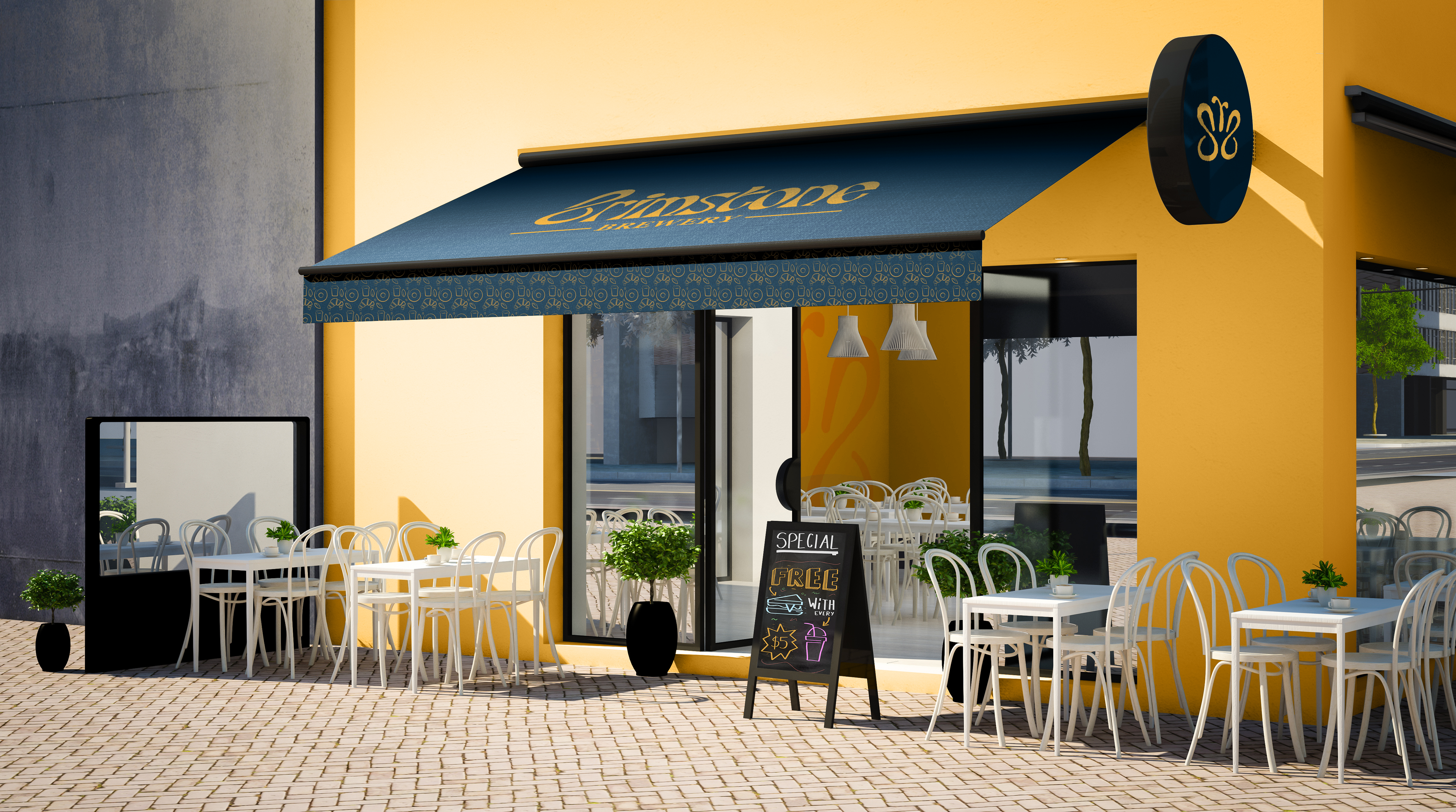
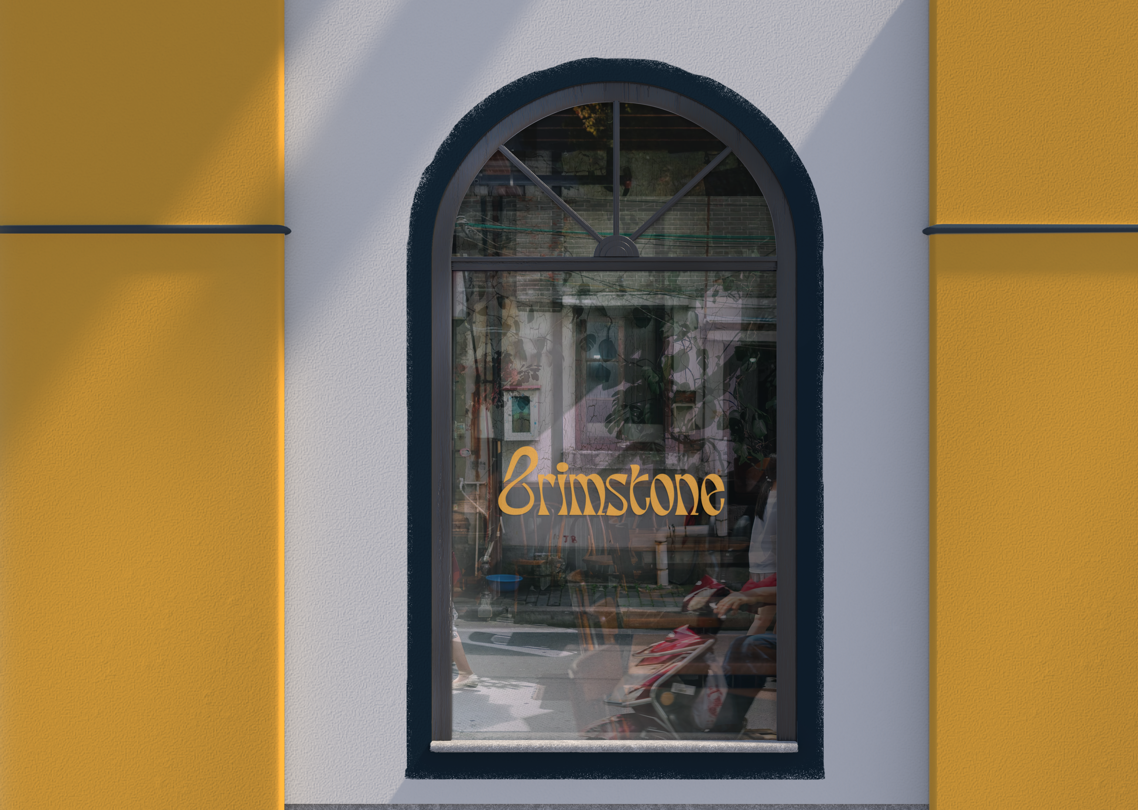
Mockups



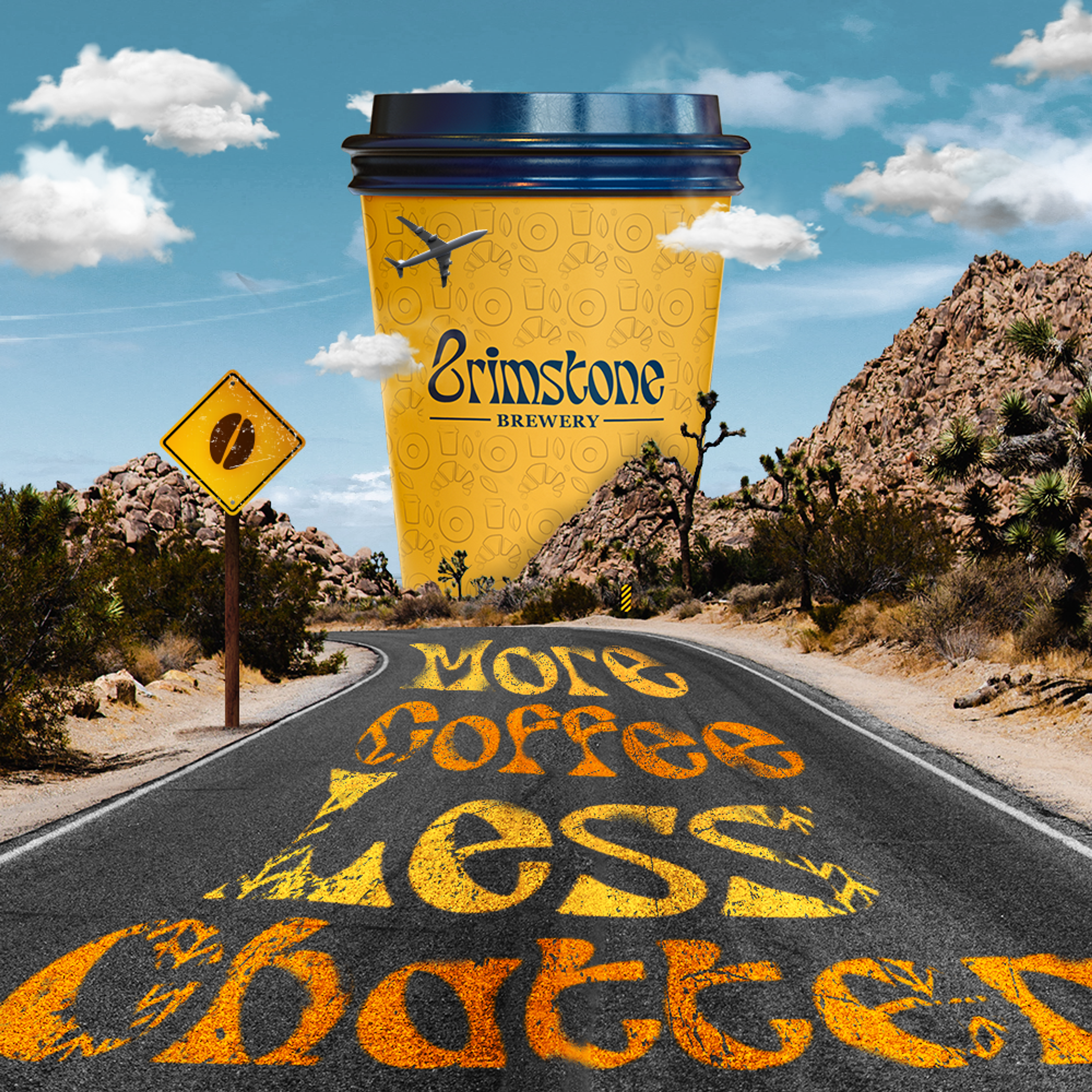
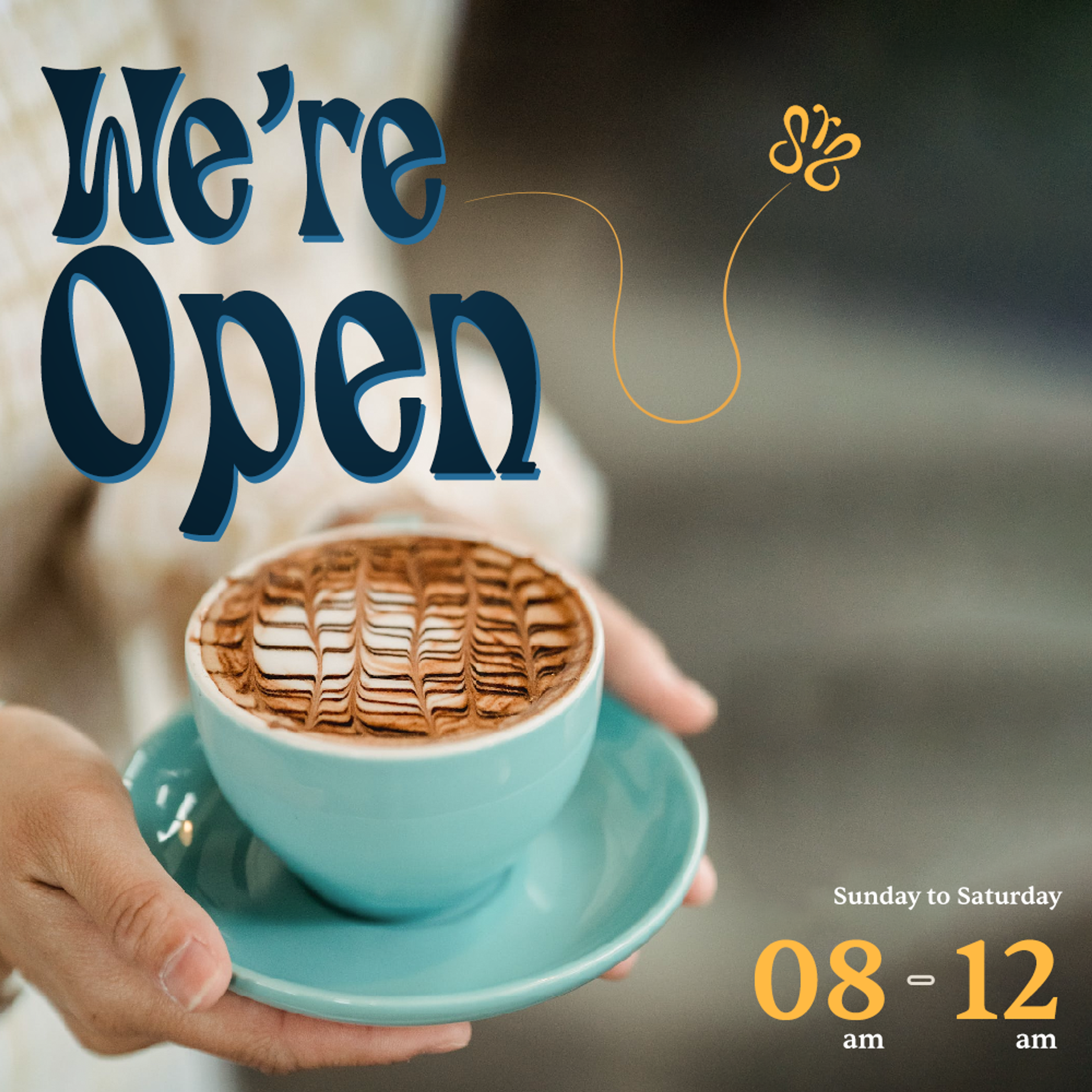
Social Media Graphics

Website
When it came to the website, the layout and content had to be simple to use.
The landing page is bold and its call-to-action takes you to our store locations.
On desktop, we display a map on the page, whereas on mobile, you can open the location in your preferred app. This was critical because we wanted the process of finding our stores simple and accessible to everyone.
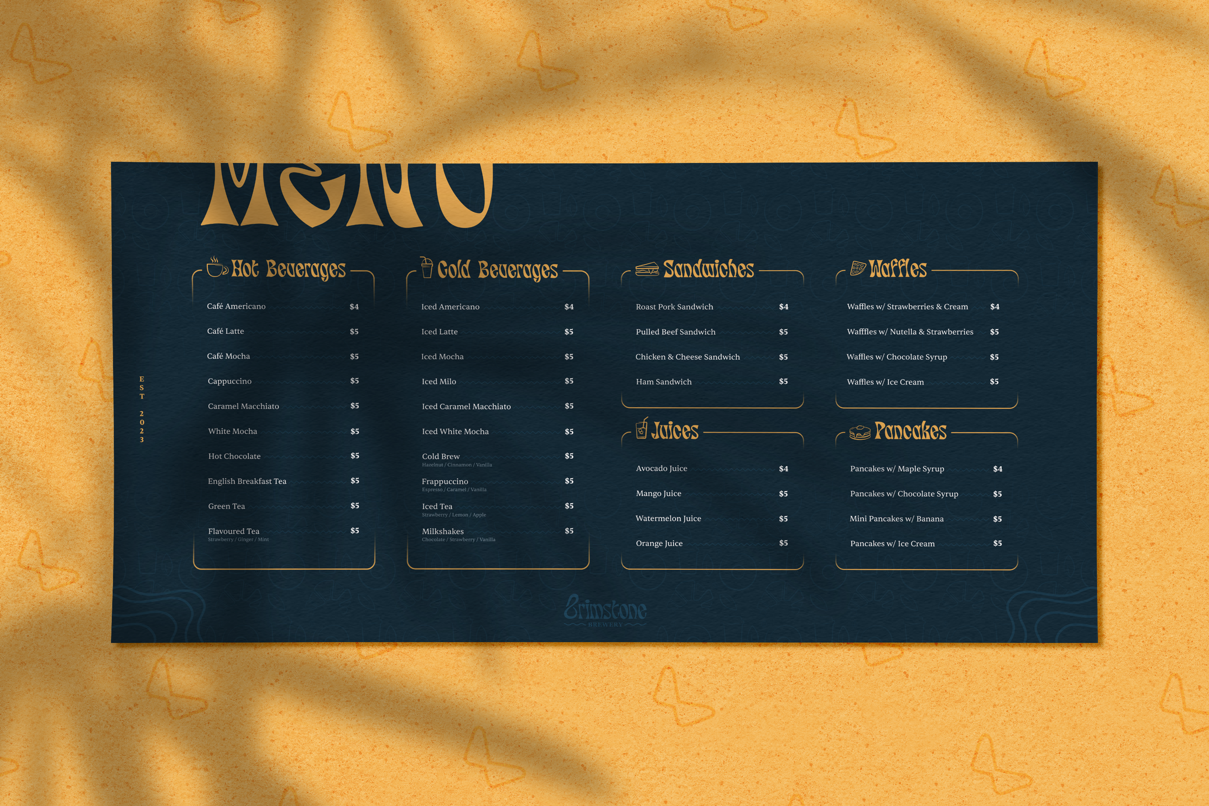
We value our customers time and satisfaction, which is why our menu is easily accessible right next to store locations.

